
Disclosure: This post contains affiliate links. I may receive compensation when you click on links to products in this post. For an explanation of my Advertising Policy, visit this page. Thanks for reading!
My WordPress site won’t load on mobile. Help!
Here’s how to get your WordPress site that won’t load on mobile to, well, load on mobile!If you’re still having trouble, reinstall WordPress. Download it again using SFTP or FTP, or a file manager in your hosting account’s control panel (specifics on these are available through your host).
Then, delete and replace your files on the server, with the exception of the wp-config.php file and /wp-content/, except for fresh copies from the download.
This will safely remove all of your core files, including your data, content and settings intact.
Don’t forget to delete the original files before overwriting them, as some uploaders are known to be unreliable when it comes to removing files.
This post will also discuss other issues related to getting your WordPress site to not only load on mobile devices, but on all devices so that it always looks great and is responsive. So let’s go!
How do I get my WordPress site to work on mobile?
These problems are best resolved, before they become a problem. That means taking the following steps while setting up your WordPress website:
- Know why responsive web design is essential to mobile and other devices.
- Take a Google Mobile-Friendly Test to see how mobile-friendly your website is.
- Make sure the WordPress theme you get is a responsive theme.
- Look into getting some mobile-friendly and responsive WordPress plugins.
- Use opt-ins that are mobile-friendly.
- Take into account responsive media while designing your theme.
As you can see, how good, bad or not at all, your website will look on mobile depends greatly on how it is designed for Responsive Media.
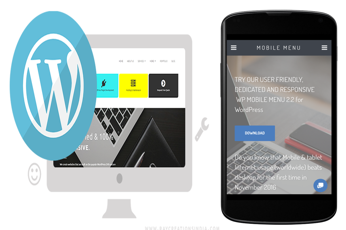
What is Responsive Media?
Responsive web design (RWD) is a type of website development that adapts websites and pages to the screen, whether it’s a desktop, laptop, tablet, or smartphone.
Why does my WordPress site look bad on mobile?
There are a number of reasons why your website may not be operating on mobile. Let’s have a look at some of the most common ones.
1) The WordPress theme is non-responsive or poorly designed.
The WordPress theme you’re using might not be responsive or it might just look bad on mobile devices. Make sure that the theme you’re using is responsive.
2) The WordPress plugin is not doing its job well on mobile.
Plugins are just like WordPress themes, some might look bad or work poorly on mobile devices, while some might even break your site altogether. Make sure that the plugins you’re using are responsive and up to date.
3) The website’s images are too large for mobile users.
Make sure that the images on your website are not too large, as this will make them seem blurry or appear broken. You can use a plugin like WP Smush.it to compress large images without losing their quality.
4) The website’s videos/movies are not responsive and do not adapt well to mobile screens.
The same goes for Flash elements, they are not supported by iOS devices, which means that if you have them on your site, it won’t work well with these types of devices.
5) HTML5, CSS3 and Javascript files are not being used enough.
These technologies are what make your website responsive to mobile users. If you’re using a lot of old-school HTML4, CSS1 and Javascript files, your website is likely not to work well on mobile.
6) The website’s code is not clean enough for mobile devices.
Make sure that the code you’re using in your WordPress theme or plugin is optimized for mobile users. Otherwise, it will seem unorganized and messy. Use a good Caching Plugin like WP Super Cache or WP Fastest Cache to speed up your site.
16 ways to make your website mobile-friendly!
After you know how your website performs on mobile, it’s time to do something about it. There are a number of things that you can do with WordPress in order to make it work well for mobiles users.
1) Make sure your theme is responsive. (Obviously, see above).
Responsive themes automatically adapt the layout, design and font size based on the device they’re displayed on.
2) Use a plugin that makes your content responsive.
There are many good WordPress plugins that will adapt your website’s content to mobile users, while ignoring desktop content completely. This way you can make sure that people who visit your site on desktop see exactly what you want them to see, without missing out on any important information for mobile users.
3) Make sure your media is also responsive.
Responsive WordPress Themes are now good at making every aspect of the website responsive, including images, videos and even plugins if you have them included in your site.
Take a look at how well they work on different devices to make sure they’re up to the mark.
4) Make sure your site is fast and optimized for mobile devices.
You can do this by using a good caching plugin, as mentioned before in order to increase speed.
In addition, you may want to consider creating a mobile version of your website for better user experience on mobiles.
There are many WordPress plugins that let you do this, like WP Mobile Edition.
5) Optimize multimedia and images for mobile devices.
If you want to increase speed even more and keep your site optimized no matter what device it’s used on, you can use a cache plugin like WP Fastest Cache in order to compress all multimedia elements and images before displaying them on your website.
This will make it work even faster on mobile devices while still displaying properly on desktops, if the plugin is set up right. (See this article for more information about WP Fastest Cache)
6) Use Mobile Analytics to understand how your users behave on mobile devices.
This way you can better understand what they want on mobile devices and optimize your website accordingly.
7) Make sure that all the plugins you’re using are up to date and responsive.
If any of your plugins are not compatible with new versions of WordPress, they won’t work well on mobile devices.
This is especially important if they affect the speed of your website or make it heavy (like an e-commerce plugin). Make sure that they’re compatible with the version of WordPress you’re using.
8) Use a premium plugin as a fallback if the free version doesn’t work well enough.
It’s important to make your site as optimized as possible for mobile users, but if you can’t do all of the above by yourself or with the help of plugins, consider buying a responsive web design from a professional company who can optimize it for you.
9) Use Apps to access your website on mobile devices.
If you’re planning on using WordPress solely for uploading content, like blog posts, videos or images, you should consider creating an app for that particular purpose if the website doesn’t work well enough on mobile devices. By doing so, you can optimize it for mobile users.
10) Make sure that your website can be accessed by mobile users in any location.
Some websites are blocked in certain locations due to security reasons, so make sure you test them out on different networks and different geolocations, including rural areas where internet connection might not be as good as it is in the city.
This will ensure that mobile users will be able to see your site no matter where they are.
11) Don’t forget about advertising!
This is especially important if you have any ads on your website.
Make sure you also optimize your website for ads and change them according to the device used to view them, as most of the time it’s not the same.
12) Don’t forget to test your website speed!
This is very important because it can make the difference between your site being accessible on mobile devices, or not.
If you are using a plugin for this purpose, make sure you set up different caching features according to each device used to view your website. This will ensure that it works perfect on all of them.
13) Don’t forget to test your forms!
If you’re using any kind of contact form or other kind of interactive element on your website, make sure that the user experience is good enough on mobile devices.
You can do this by simply checking how they work with different browsers and geolocations.
14) Make sure that your website is secure, especially if it’s aimed at mobile users.
Some people like to check out websites they find interesting or useful on their smartphones while they’re browsing the internet through insecure networks (like public Wi-Fi).
For this reason, make sure that your website is secure and that you can’t be hacked by setting up a security plugin .
15) Use Google Analytics to understand how your users behave on mobile devices.
By simply checking the behavior of your website’s visitors, you can improve its performance on mobile devices.
This way, you’ll know what they do most of the time and optimize it accordingly.
You don’t have to check it each time you make an update, because it can cause slowdowns.
16) Always test things before publishing them!
Even after 15 points above, it’s always good to test your website before publishing it.
Just because something worked well on a desktop computer or laptop doesn’t mean that it won’t work properly with mobile devices and vice versa.
Make sure everything works great everywhere and you can reach as many users as possible.
WordPress site won’t load on mobile. FAQs, fixes and conclusions.
To conclude, all of the above will help you make sure that your website is optimized for mobile devices.
This way, you’ll ensure that mobile users see your WordPress website the same way other users do, if not better.